
How to mix prints and embroidery in the same look
To mix prints and embroidery, look for a relationship between the colors and a difference in the sizes of the motifs. Then decide how much space each pattern will occupy. A jacket with large flowers can coexist with a thin stripe; an openwork blouse can accompany a printed skirt if both details retain space to stand out.
There is no forbidden combination, nor do you always need to reduce an outfit to a single decorated piece. It does help to understand why a mix looks good in a photo but stops convincing you once you put it on: perhaps the patterns have the same scale, they crowd together in a small area, or you add accessories that change the distribution. The goal is to be able to adjust one variable at a time.
Separate color, size, and relief before combining
A print is perceived mainly by its design and color; an embroidery also adds the relief of the threads or appliqués. This difference allows you to combine nearby motifs without them appearing identical. Look at the garments up close and then from a few paces away: a tiny pattern can visually become an almost uniform surface.
Mentally note the background color of each piece. Then identify the most prominent motif and its size. Two garments called "floral" can behave in very different ways: large, spaced-out flowers do not occupy space in the same way as a field of small, tightly packed flowers. The name of the print tells you less than that distribution.
The concentration of the embroidery also has an influence. A design limited to the yoke leaves the rest of the body more uncluttered. One that runs along the sleeves, front, and hem occupies a larger surface. For your first test, keep only the two garments you want to mix and use plain shoes and bag; this way, you can evaluate the relationship without other distractions.
A color connection that doesn't require an exact match
Look for a color present in both garments, even if it appears in different amounts. It can be the dark background of a skirt and a fine line on the jacket, or the ecru of the embroidery and a part of the print. That repetition offers a recognizable connection without the need for all tones to be identical.
If they don't share any color, use a plain intermediate garment: a t-shirt, top, or layer that is visible between both. For example, an embroidered jacket over a white t-shirt and plaid pants leaves a separation zone in the center. The t-shirt doesn't eliminate the mix; it makes it more visible where each pattern begins.
Avoid deciding based solely on the color name on a screen. Compare the garments together in indirect natural light. An almost-black blue and a black can create a difference you like; a very bright white next to an ecru can create more contrast than expected. These are results to evaluate, not mistakes you must always correct.
Combine different scales
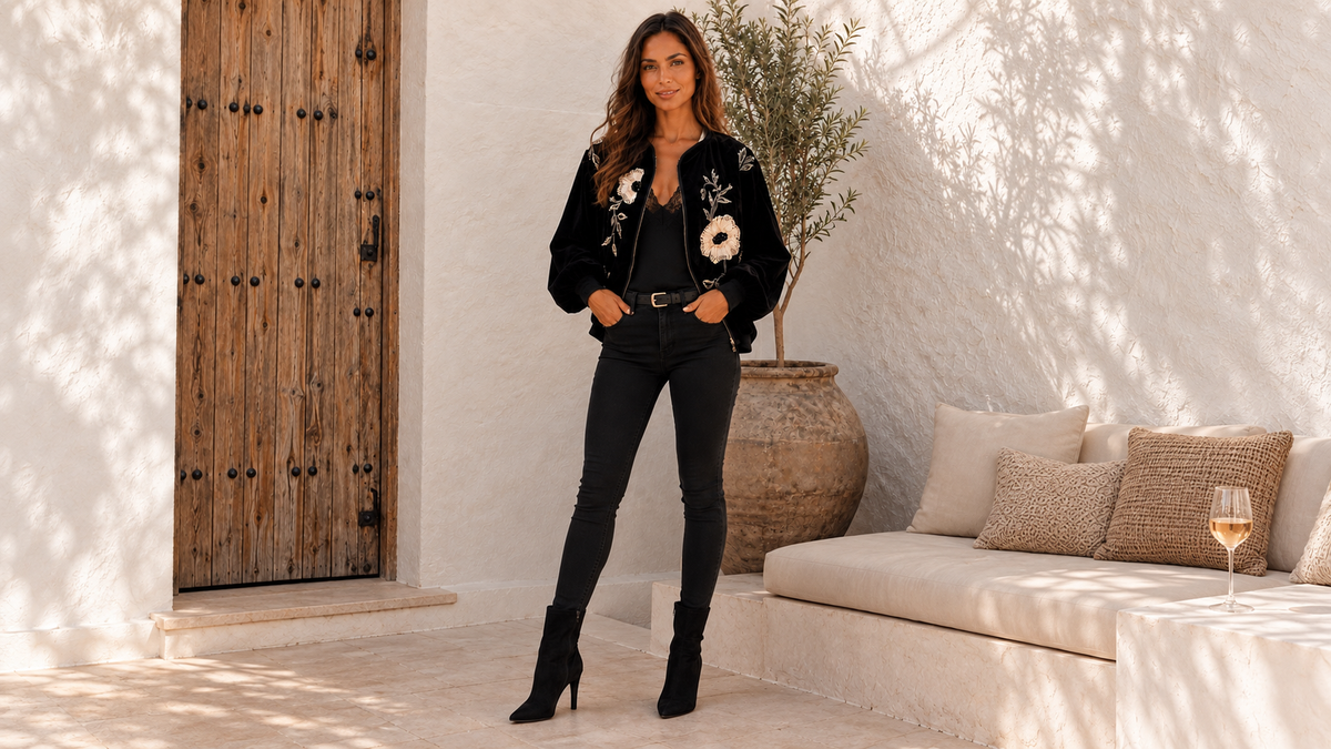
Try a large motif with a small one. The Lotus Flower Jacket, with light flowers on a black base, allows you to imagine that relationship with a narrow-striped t-shirt and plain pants. By leaving the jacket open, the stripe appears in a central strip and the flowers retain their surface on both sides.

The photograph shows the jacket with a black base. To test the proposed mix, replace only the top with a striped one you already own. If it doesn't convince you, change the distance between the stripes or reduce how much of the top remains visible. This way, you will know if it is the specific pattern or its quantity that bothers you, instead of discarding all stripes.
You can also mix two motifs of the same size if you are looking for a more intense result. In that case, it is advisable to check the colors and the area where they meet especially closely. A skirt and a jacket with large flowers can work together, but the outfit will have a different presence than the combination of large flower and small stripe.
Four combinations to try with your wardrobe
Thin stripe and embroidered flower
Use a narrow-striped t-shirt under a floral jacket and leave the pants plain. Start with a stripe that repeats the background of the jacket. If the collar of the t-shirt is very close to the embroidery, try another neckline to create a separation. The earrings can be small while you compare both versions.
Printed skirt and tone-on-tone patterned blouse
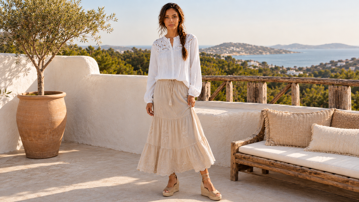
The Bougainvillea Guipure Blouse incorporates a guipure panel in the same tone as the garment. You can take its color as a reference for a printed skirt that contains it. The guipure provides pattern and texture without introducing several additional colors itself; decide later whether to wear the hem untucked to preserve the full panel.
Discreet check and colorful embroidery
Try small-check pants with an embroidered jacket and a plain t-shirt between them. Observe the pants from a distance: some checks read almost as a gray or brown background. If the check still stands out a lot, avoid adding a decorated belt right at the point where the two garments meet.
Vegetable print and light lace
A leaf or flower skirt can accompany a light blouse with lace. Decide which pattern you want to see first: if it is the skirt, keep accessories close to the tone of the blouse; if it is the neckline, avoid covering it with a scarf or necklace. The contrast can be soft or marked depending on the print's background.
The distance between patterns changes the result
Two motifs that meet directly at the waist are read together. If a plain t-shirt shows between the jacket and the skirt, a pause appears. If the jacket is closed, it can completely hide the interior pattern. That is why it is advisable to test the outfit in the state you will actually wear it most of the time.
A printed bag also participates in that distribution. Carried in the hand, it may remain separated from the embroidery; worn across the chest, it overlaps it. Test its position before discarding it for the design. Also check the physical contact of the strap with threads and appliqués, without assuming that all surfaces glide well together.
When the embroidery has shine, light modifies how much it stands out. You can review the relationship with jewelry and accessories in our guide on how to combine golden embroidery. Keeping a regular piece of jewelry is usually enough to evaluate the outfit without adding several new finishes at the same time.
How to correct a mix you don't quite like
First remove an accessory, then change the amount of visible garment, and finally replace one of the patterns. That order allows you to make use of the pieces you have already chosen. If you change the jacket, shoes, bag, and top all at once, it will be difficult to know which adjustment solved the feeling that bothered you.
Take a full-body photo and another of the upper area. At a dinner, the neckline and sleeves will be very prominent; during a walk, the complete combination will be seen. To compare other chromatic relationships, consult the autumn color combinations and keep those that already appear in your garments.
Questions about mixing motifs
Can I combine flowers with flowers?
Yes. Try small flowers next to larger ones or a shared palette with different backgrounds. If you want an intense mix, you can maintain similar sizes; then check how they meet at the waist and neckline.
Does lace count as another print?
It is not the same, but its pattern does participate visually in the set. A lace of the same tone usually introduces less chromatic contrast than a multi-colored motif. Evaluate the result at the usual distance of use.
Should I wear all plain accessories?
It is not mandatory. Start with them plain to understand the main mix and then add the accessory that interests you. If, upon incorporating it, the embroidery you wanted to highlight is no longer visible, compare another position or a different size.